AW32 - Task 3.1 Packaging
- Desislava Ilieva
- Feb 20, 2023
- 3 min read
Updated: Mar 3, 2023
Practical assignment (creative problem solving)
Using the logo you created in Week 1 and the brochure you designed in Week 2, think about your brand and design packaging for your product. Remember that you can decide about the detail of your product. Is it dog biscuits, meat products in a tin, dry pellets or a new and exciting product?
Do your design according to the following steps:
Exploration Use sketching techniques to draw thumbnails and hand in your thumbnails as scanned PDFs.
Brand integration Choose one of your thumbnails and refine your design. Place it next to your brochure and logo and see how you can merge your design with the brand identity. Also, what fundamentals of the brand can you draw from and use in your design? Hand in a picture of your thumbnails, mock-ups, logo and brochure together.
Design Now design your packaging properly, using any design application of your choice (or a combination of e.g. Photoshop, InDesign and Illustrator). Export the flat design as a PDF.
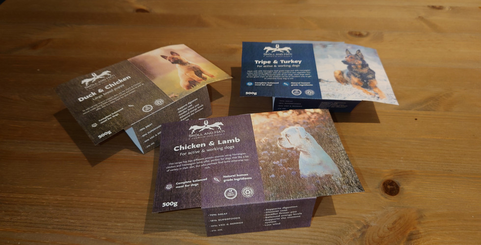
Testing Print out the final design and make a mock-up. Make sure all panels line up when folded and glued. See to it that the information flows well on all panels.
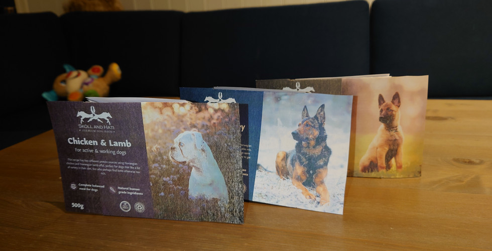
Presentation Take pictures of your printed mockup to show off the various aspects and angles of your packaging. You can also make a digital mock-up*.
* You are allowed to use found Photoshop mockups of the packaging, but don't let the available options limit you. Rather explore unique packaging solutions that enhance your product offering.
Exploration
Here are the thumbnails and additional sketches I started with after I was done with my research.


Brand integration
Here is the design I decided to refine. Since the food that is going to be sold is raw and fresh, the company will need packaging that can be sealed and kept in the fridge for an extended time. I went with a recycled, plastic container similar to a plate and paper packaging that is wrapped around it with all the information about the product. Since the brand is fictional and does not have any products I chose to borrow the package sizing from a mock-up I found online.


My idea for the brand is to have a high-quality, premium feel so the packaging design had to fit with my logo and brochure.


Design
Following my sketches and sizing I made the flat design in Illustrator.

I borrowed the dog food information from other brands and used stock photos. I used some of the I then started designing each panel, trying to stay as close as possible to my brochure design. I used pieces from my brochure on one of the side panels and the feeding guide on the back. As I did in my brochure, I strategically chose the photos. I used photos of dogs that are facing the information available in order to lead the reader's eye to it instead of away from it. I generated the barcodes online for each design.
I even used the same colors as my brochure for the first design.

PDF file:
I then decided to create two more designs for different kinds of food.

PDF file:
One for puppy food.

PDF file:
Testing
Since there is no way for me to print the plastic part of the package I only did the paper designs.
Presentation
A mock-up showcase of the logo, brochure, and packaging design together in digital form.

Some individual packaging mock-ups


Comments