Practical assignment (observation and analysis)
Use the logo you created in Week 1 and design a brochure for your product. You may use any format you like, just make sure that the format is in line with and adds to your logo design. Your brochure must contain an illustration. This could be the infographic alone, or it could be the infographic and the rest of the brochure (in other words, the entire brochure may be illustrated if you'd like). When designing the brochure and creating your illustration, make definite use of the fundamentals of visual language as discussed in this lesson. You must illustrate an infographic and design a brochure:
1. Illustration of infographic
The brochure design and infographic illustration should work together. Consider the format and style of your brochure and illustrate an infographic using fictitious data (or you could research to get a better idea of actual statistics). The infographic must display the nutritious benefit of your product to dogs. It should contain nutritional value, as compared to the necessary nutrition intake of dogs. It must also give an indication of consumption per size of dog. You may also add information of your choice that you think is relevant.
2. Design of brochure
Design a brochure that introduces your product and includes the infographic illustrated in Question 1. You can decide on the information and format of your brochure. As a guideline, consider a brochure of A4 (lying), folding to A5 (standing). You don't have to have more than four pages in your brochure (but it depends on your design and style). You must base your brochure design on the design of your logo. Thus, look at your logo and design a brochure that complements and blends in with it.
1. I designed my infographic to fit fully inside the brochure. The data I used is from research I did online and therefore accurate.

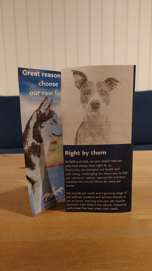
2. For the brochure I decided to do a tri-fold style in size A4. I started by creating a low-fidelity layout on a piece of paper and laying out a rough plan for the brochure. I wanted to use photos of dogs that are similar to wolves to fit better with my logo. The color palette is in different shades of blue and white, borrowed from the images. I used Karol Sans bold font for titles and book for small text. I strategically chose the images and illustrations. On the inside the dog is facing the information, leading the reader's attention to the information on the infographic, and the dog illustrations are facing the opposite way to draw the viewer's eye back on the page, instead of away from it. The front cover has two images of dogs looking at the reader. This aims to portray the seriousness and trust customers can have for the company. Here is the full brochure:
Outside

Inside

A digital mockup I did to better showcase my idea.

I also decided to print the brochure as a real-life mockup. (My printer is definitely not meant for this)


Kommentare