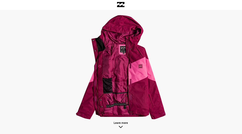
Billabong has decided to create a campaign, especially for a new item of clothing, a snow jacket like this one.
Potential customers who see the product on Instagram can click through to the landing page to learn more about it. Your task is to design a high-fidelity long-form landing page for this product (using Figma or Adobe XD). Check out the Mac Pro landing page for inspiration. Upload a link to your prototype, as well as screenshots of the final page.
For this landing page, I was mostly inspired by the Mac Pro landing page as well as the video for the jacket that Billabong had on the website. I used the website's background colors and font and kept the page clean and minimal. I decide to only include the logo on the header that would link the viewer to the website if they wanted to go there.

When scrolling down we get to the name and description of the item as well as the front and back view of the jacket.

After that, we come to the "Features" section

Next, we come to zoomed-in sections of the jacket that showcase how the jacket will help the customer and solve their problems with the weather. I included only 3 features per photo, to keep the design simple and even.


After that, we have a section for the product's Shipping, Return, and Materials.

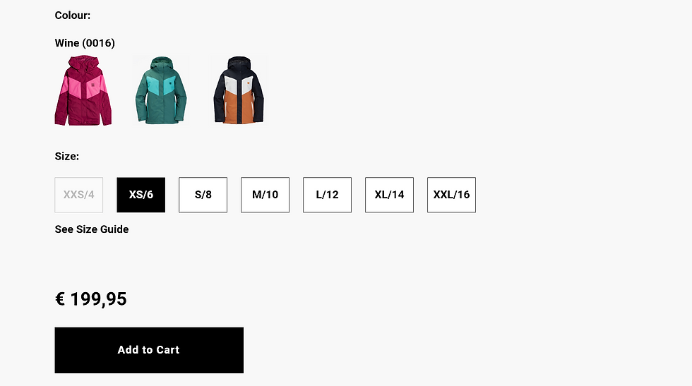
Last we have the color and size options that are currently available as well as the price and "Add to Cart" button.

Conclusion: My design aims to represent the customer with all the necessary information about the jacket, how it will solve their problems, and lastly to give them options for their purchase. I would have included some animations and transition effects if I had more time, but I believe it looks nice now too. I tried to follow a Z pattern as much as I could and overall I believe I did a good job with the landing page.

Comments